Recreating the New Dropbox Header Animation
Dropbox just revamped their branding - and their website. The new header uses a cool clipping effect, which we’ll recreate.
If you haven’t checked out the new Dropbox landing page, do it and pay special attention to the header as it moves over the different colored sections. You can see the effect in the gif below.

The header effect Dropbox uses to highlight their new brand colors.
So how is it done? It can’t be blend modes, as those only work in Chrome, but Safari works as well.
When inspecting the DOM, one quickly notices that the header is inside every section - always with the correct colors for that section. It has position: fixed, so why isn’t it permanently visible and only relative to the parent section? CSS masks, which fortunately most browsers support.
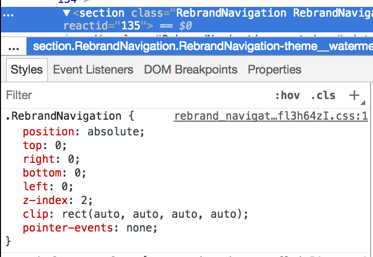 The clip property, accompanied with absolute positioning, will clip containing fixed positioned elements.
So, to make it work, one needs:
1. A relatively positioned section which will hold the content.
.section {
    position: relative;
}
2. Inside it, an absolutely positioned container that spans the whole section and clips its content. When set to auto, it will automatically use 100%.
.section__absolute-container {
    position: absolute;
    top: 0;
    bottom: 0;
    right: 0;
    left: 0;
    clip: rect(auto, auto, auto, auto);
}
3. Inside the absolutely positioned container, the fixed positioned element with a transform to make Safari happy.
.section__fixed-element {
    position: fixed;
    top: 0;
    left: 0;
    /* without a transform, Safari will have weird rendering bugs.
       transform: translate3D(0, 0, 0) and similar also work */
    transform: translateZ(0);
    will-change: transform;
}
This would be valid HTML with these classes:
<div class="section">
    <div class="section__absolute-container">
        <div class="section__fixed-element">
        </div>
    </div>
</div>
Here is a good JSFiddle that shows this technique.
Update
/u/usmonov mentioned on Reddit that the jQuery plugin Midnight.js achieves the same effect in all browsers. It uses a combination of overflow: hidden and JavaScript applied transforms to achieve this. The transforms are applied using a requestAnimationFrame, so no active scroll listener - which is really good! Using CSS masks is still better, in my opinion, as it doesn’t need JavaScript running every 1/60s to work.